
Building the design muscle at a construction technology startup
Mastt · Lead Product Designer
TL;DR
- What I'm proud of: New shortcuts on the project tile that customers loved, fewer support questions, and a business that started to see design as more than making screens look nice.
- What I did: Fixed something visible in my first week, made the state of design visible to everyone, set up a design hub, hiring process and design system, and used data to frame the value of design work.
- The question: How do you build the design muscle in a startup that has never had one, while shipping improvements people can actually feel?
- What I walked into: Most people rated the organisation's design maturity as poor, usability scored 51.75 on SUS, and users found Mastt hard to learn and navigate.
- What I signed up for: Improve the quality of Mastt's product, help the business understand research and design, and find the work that drives profitable growth.
What I signed up for
Mastt is a construction technology startup that helps teams manage the cost, claims and risk of capital works projects and portfolios. I joined as Lead Product Designer to build the design function from scratch, working with the co-founder and the Head of Engineering. The key job was to:
- Improve the quality of the existing product
- Influence the business to understand research and design
- Identify valuable work that increases sales and drives growth in a profitable way
What I walked into
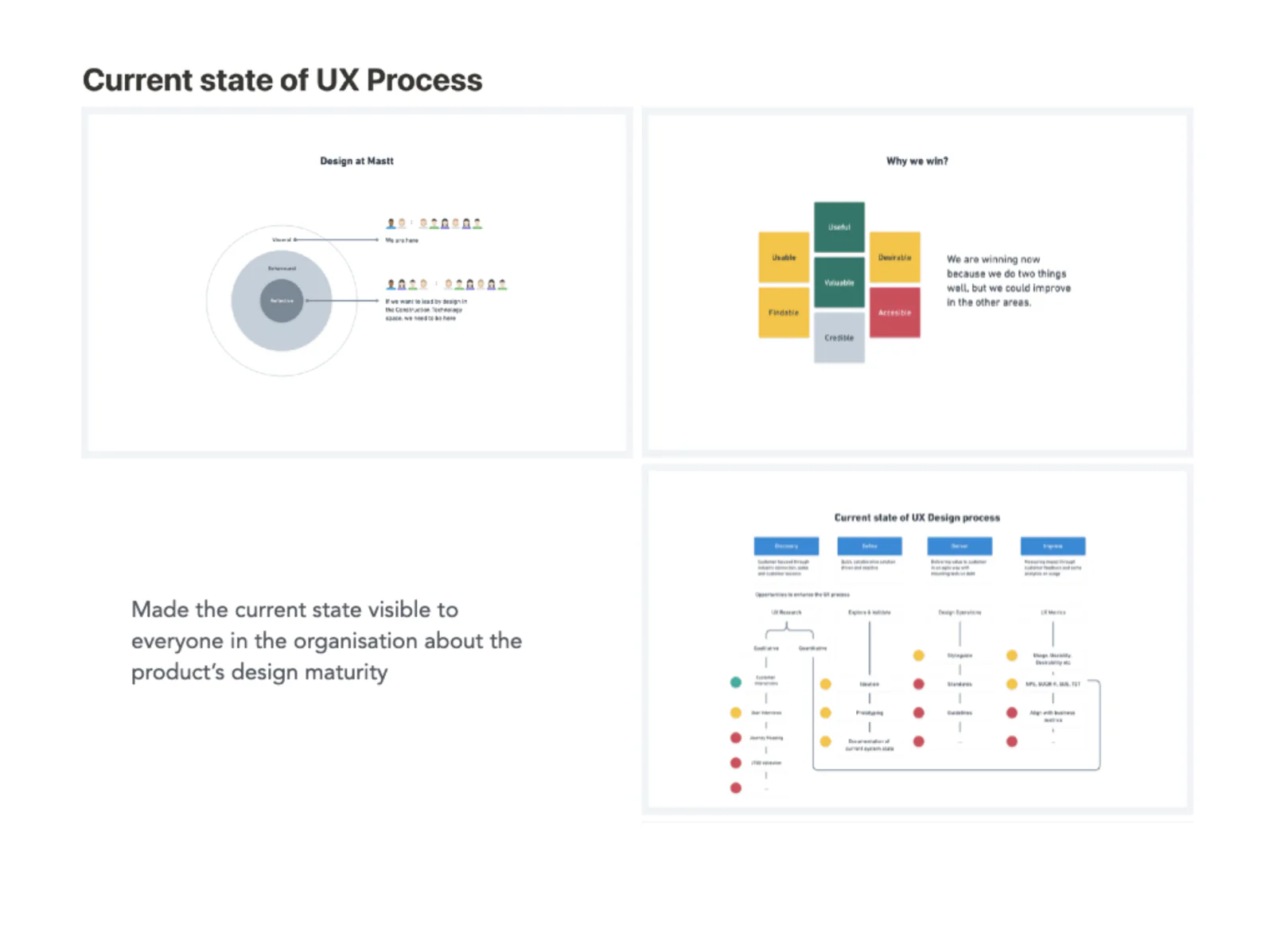
Before changing anything big, I wanted everyone in the organisation to see where design actually stood. So I mapped the current state of our UX process: where design sat at Mastt, why we were winning, and where the gaps were.
We were winning because we did two things well: the product was useful and valuable. But there was plenty of room to improve on being usable, findable, desirable, credible and accessible.
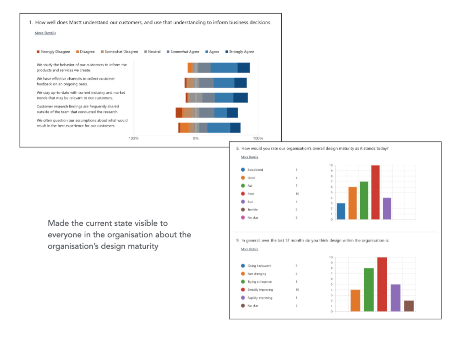
I also ran a design maturity survey across the organisation. The most common answer to "How would you rate our organisation's overall design maturity today?" was poor.
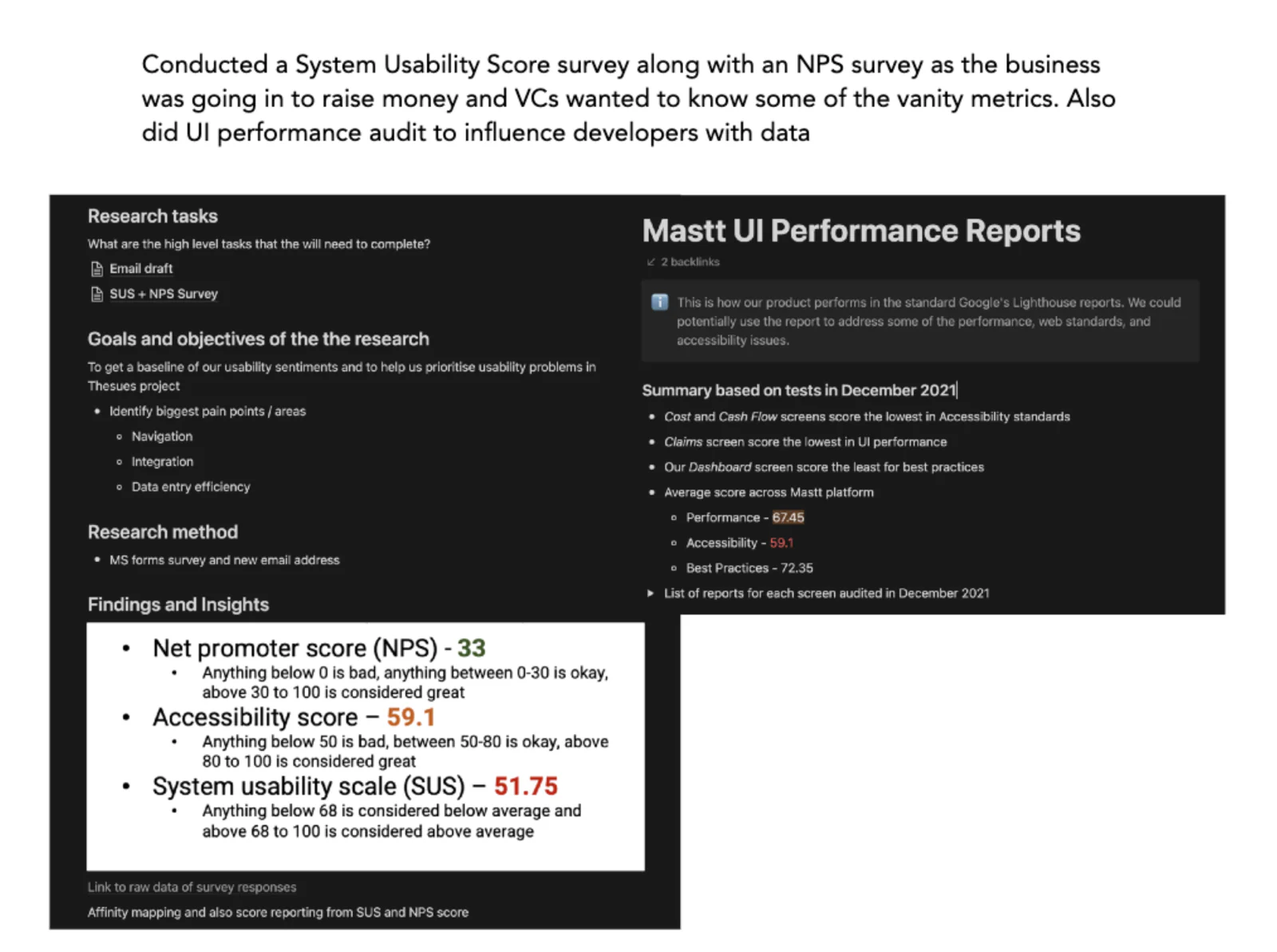
When the business was about to raise money, investors wanted to see some headline metrics. I ran a System Usability Scale (SUS) survey alongside an NPS survey. I also ran a UI performance audit using Google's Lighthouse reports, to influence developers with data.
- NPS: 33. Anything above 30 is considered great.
- Accessibility: 59.1. Okay, but far from great.
- SUS: 51.75. Below the average of 68.
The Cost and Cash Flow screens scored lowest on accessibility, Claims scored lowest on performance, and the Dashboard scored lowest on best practices.
What I had to figure out
How do you build the design muscle in a startup that has never had one, and prove its value quickly, while the product keeps moving?
Getting stuck in
Earning trust in the first week
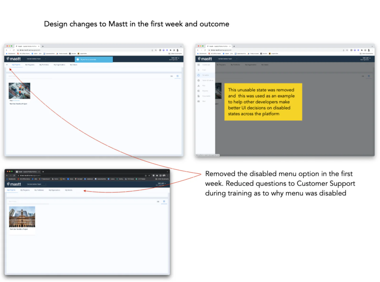
I wanted to show early that small design changes make a real difference. After logging in, users saw a menu that was greyed out and unusable, with no explanation why. I removed that disabled menu in my first week.
It cut down the questions Customer Support got during training about why the menu was disabled. It also became an example I used to help developers make better decisions about disabled states across the platform.
Three things at once
From there, my work settled into three areas: spreading design, framing the value of work, and moving toward product-led growth.
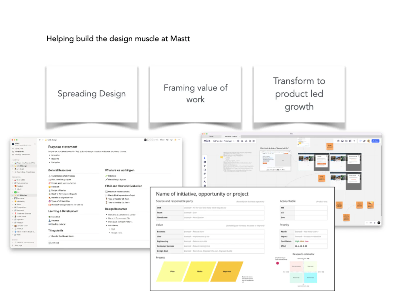
Spreading design
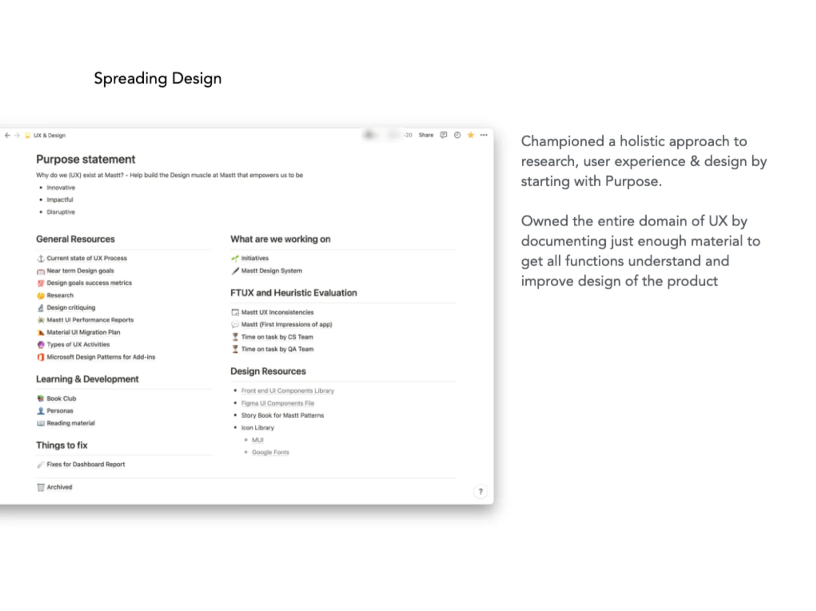
I started with purpose. Why does UX exist at Mastt? To help build the design muscle that empowers us to be innovative, impactful and disruptive.
I set up a design hub in Notion and documented just enough for every function to understand design and help improve the product: the current state of UX, near-term goals and success metrics, research, design critiques, performance reports, a book club and design resources.
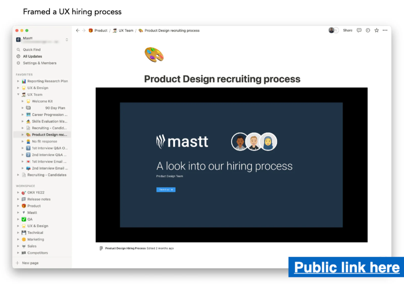
I framed a hiring process for the product design team, from the first interview through to a welcome kit, a 90-day plan and a career progression framework.
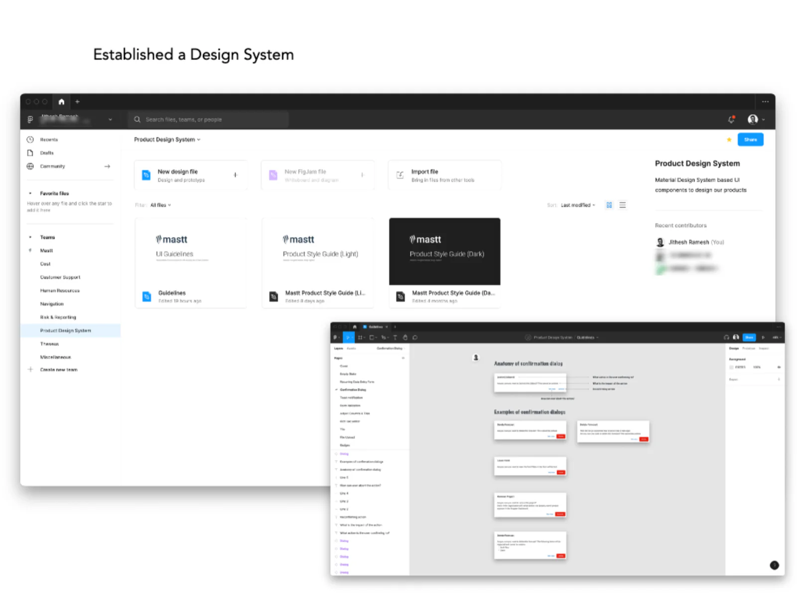
I established a design system based on Material Design, with UI guidelines and product style guides in light and dark.
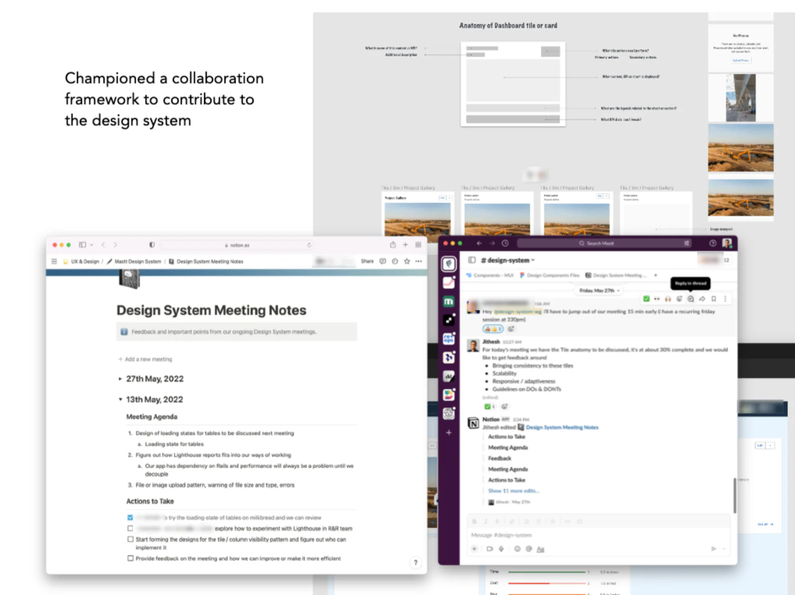
A design system only works if people contribute to it, so I championed a collaboration framework around it: regular design system meetings with agendas and actions, and a Slack channel where designers and developers reviewed work in progress together.
Framing the value of work
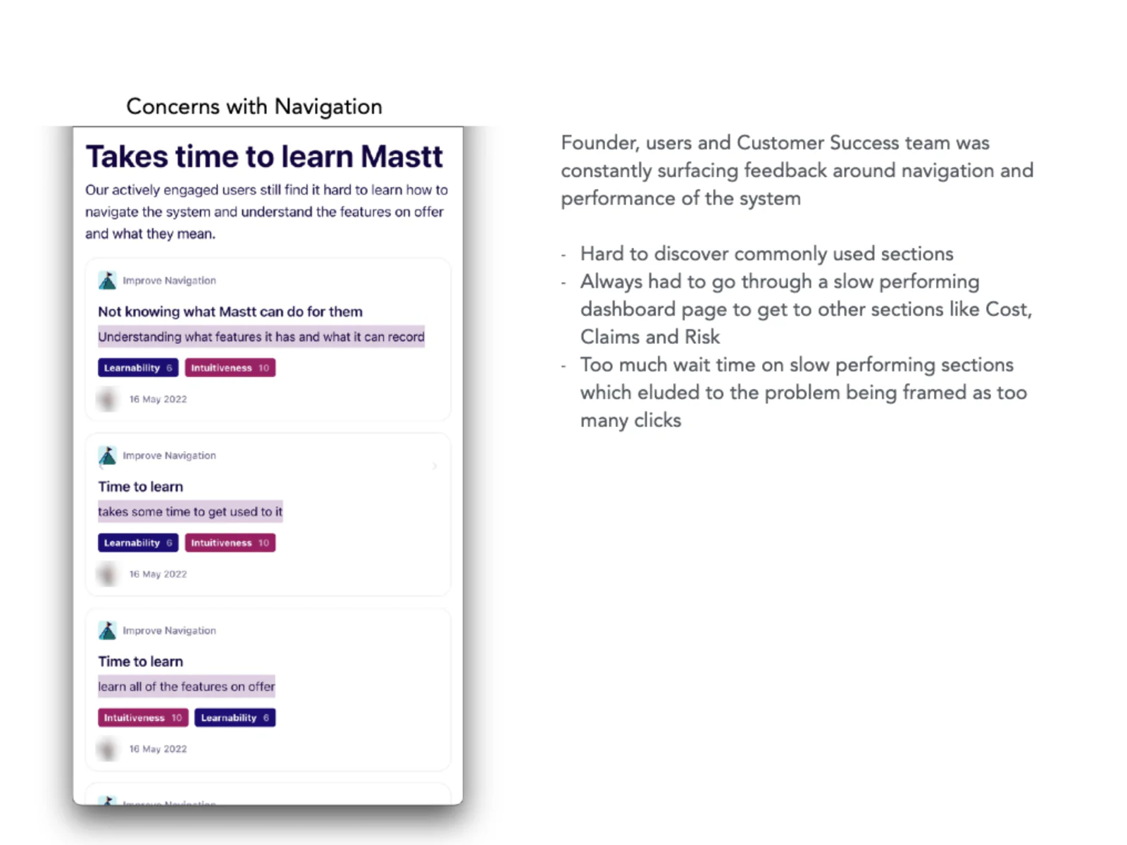
The founder, users and the Customer Success team kept raising the same feedback about navigation and performance:
- Commonly used sections were hard to discover
- People always had to go through a slow dashboard page to get to sections like Cost, Claims and Risk
- Waiting on slow sections made it feel like the problem was "too many clicks"
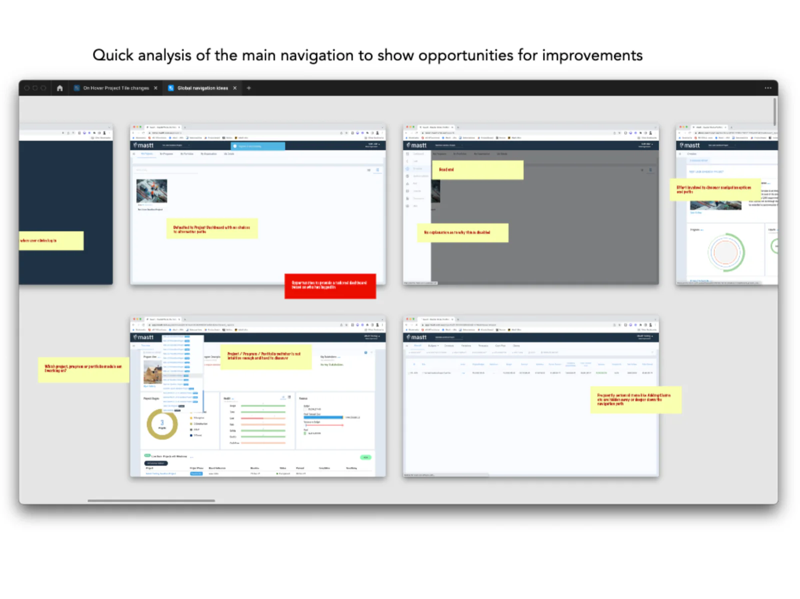
I did a quick analysis of the main navigation to show where we could improve. After logging in, users landed on a project dashboard with no other paths. The project, program and portfolio switcher was hard to find. And frequently used areas like Claims were buried deep in the navigation.
Shortcuts to where people actually go
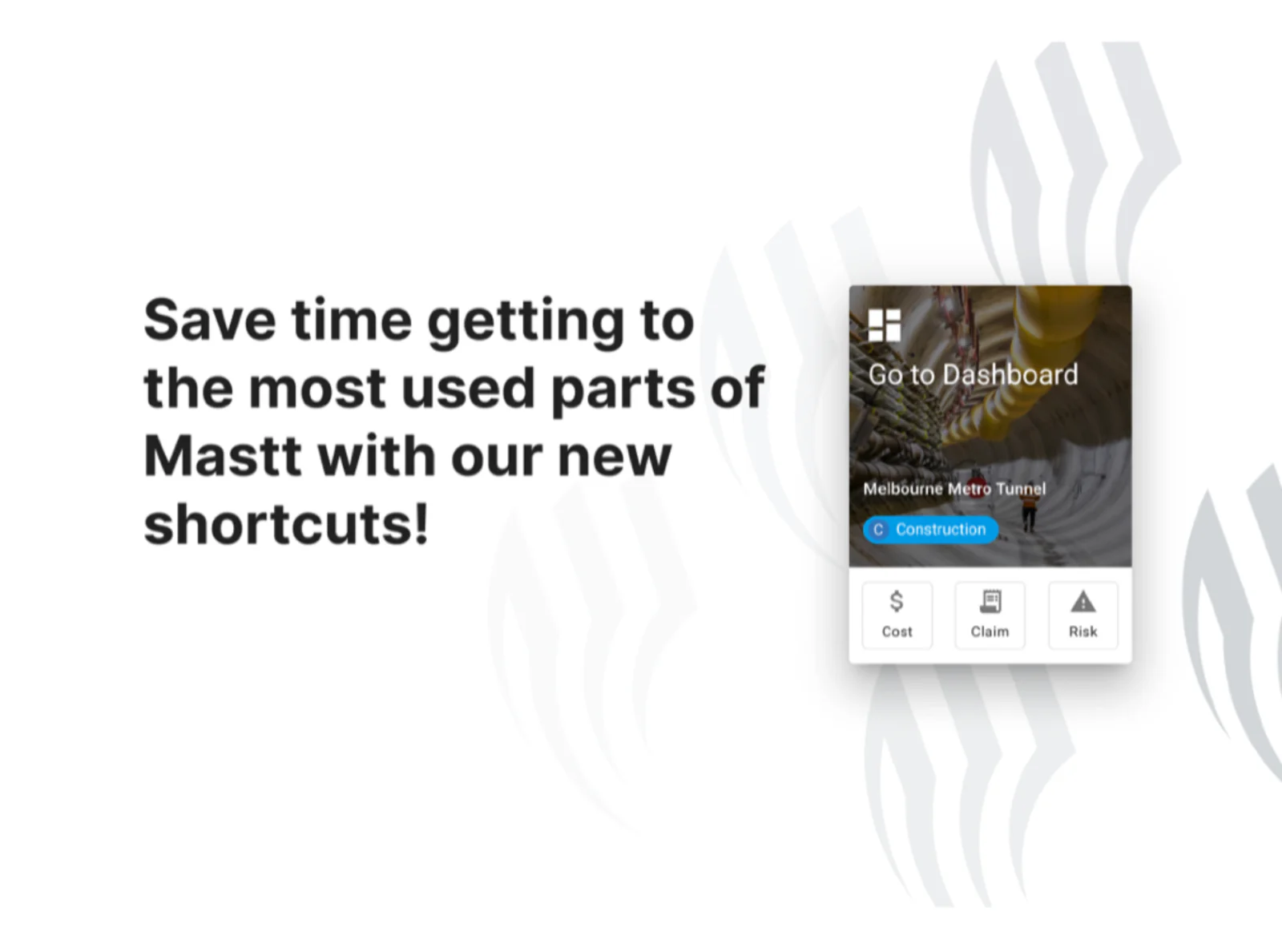
Instead of rebuilding the whole navigation, we added shortcuts to the most used parts of Mastt right on the project tile: Cost, Claims and Risk, plus a way into the dashboard. Users could skip the slow dashboard and go straight to the work.
What I'm proud of
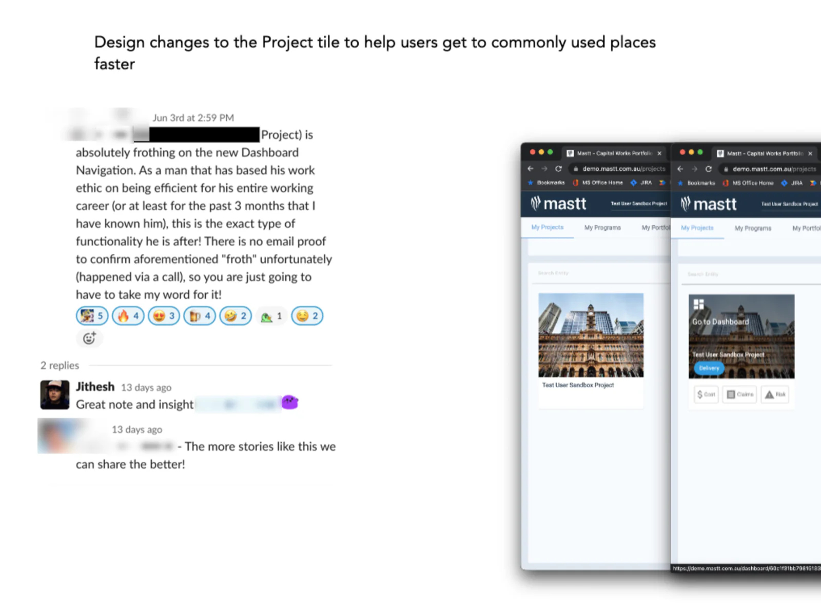
The shortcuts landed well. One of our team shared that a customer was "absolutely frothing" over the new dashboard navigation, because it was exactly the kind of efficiency he'd been after.
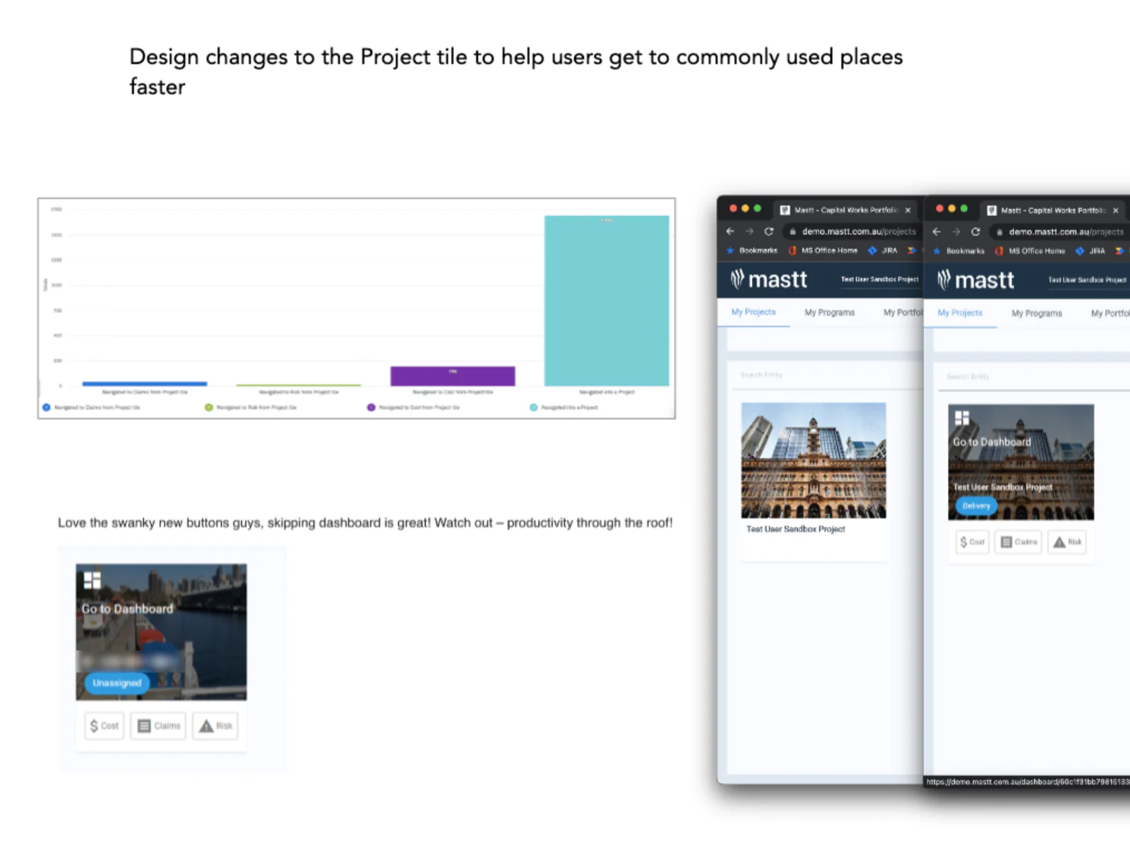
Another user said: "Love the swanky new buttons guys, skipping dashboard is great!" We tracked how people used the new shortcuts, with Cost the most used of the three.
More than any single screen, I'm proud that design became visible at Mastt. Everyone could see where we stood, how we worked, and why the work mattered to the business.